Thursday, August 5, 2010

The Dream Team

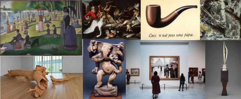
I’m going to follow in Sandy’s footsteps and talk about a tour theme that I never got to do. For one, I could never think of a good enough title. It kept turning into “Pieces that have crazy backgrounds that no one knows about.” Pretty lame. Adrienne told me that I should call it “Past Lives”, and if it ever emerged, that’s what it would be.


Pablo Picasso, The Old Guitarist, 1903-04.

An icon of the Art Institute, and the highlight from Picasso’s Blue Period, this piece is a real crowd pleaser. With students, it’s great to talk about how color is important to the mood and meaning of a piece. But one of the most interesting parts about this painting is what’s behind it. X-Rays and ultraviolet photography show that Picasso used this canvas to paint two other pieces. You can even see a woman’s eyes in the paint above the guitarist’s head. There is also a visible seam where Picasso painted the canvas over the leaves of his kitchen table. Poor Picasso was so broke! No wonder he was blue.


Charles Ray, Hinoki, 2007
As Sandy said, the interns love Hinoki. I mean it’s a tree. In a museum. Carved from another tree. Love. It.


Egyptian Model Boat, c. 2046-1794 B.C.
I know I’ve used this before, but anything that has to do with death and mummification is a hit with any student. This boat was supposed to come to life with the person in the afterlife to guide them to safety. Using this piece also pays tribute to my favorite childhood movie, The Indian in the Cupboard. Things coming to life → always a good pick for a tour.


Henri de Toulouse-Lautrec, At the Moulin Rouge, 1892 (right) and Equestrienne, 1887 (above).

I’ll admit it, I just really love Lautrec. The creepy faces, weird colors and all. Maya and I had a great discussion about these paintings on an adult tour. People can talk about them forever! The Moulin Rouge painting once had the green woman (presumably French dancer, May Milton) cut out because dealers didn’t think it would sell. All the figures have their backs turned to Milton because she was about to head off to America to become a big star. Lautrec even painted himself into the background! The Equestrienne painting was displayed on the wall of the Moulin Rouge as visitors walked in.


Ivan Albright, Picture of Dorian Gray, 1943-44
In the beginning of the Summer I hated this piece. So. Much. But now, I’ve grown to love it! This was painted for the 1946 movie of Oscar Wilde’s book, The Picture of Dorian Gray. Though the movie was filmed in all black and white, this portrait was the only part of the movie to be filmed in color. Creeeepy.


Felix Gonzalez Torres, "Untitled" (Portrait of Ross in L.A.) 1991
Who doesn’t love candy? Felix Gonzalez Torres created this portrait of his boyfriend, Ross, after he died from AIDS. The candy is set every morning at 175 lbs., Ross’s ideal weight. Throughout the day visitors are asked to take a piece of candy, causing the piece to shrink and loose weight. It shows Ross’s sweet and colorful nature, as well as the regeneration of life every morning. Plus the students get to pick out their own piece to eat! Incredible edible art.

So that's the dream tour. And hopefully one day someone can use it! This internship has been an incredible experience. I've never met a more encouraging, enthusiastic group of people, and I was actually excited about coming into work each morning. Annie from adult programs told us that we'll probably run into each other at CAA (College Art Association) conferences screaming and hugging. I can only imagine...

FANTASY TOUR: The Little Tour That Could

With our time at AIC coming to a quick close, it's fun to reflect on the tours that never were. David and I stuck pretty firmly to our Travel & Transformation Tour - alternating the order and pieces that we used and sharing research with one another, since after all it was such a solid tour theme. In addition to our Travel & Transformation tour, we also had to put together ABCs In Art Tours which included "Animals In Art", "Color, Line, and Shape", and "My Five Senses" for younger audiences which focus more on the experience of interacting with the artwork and aren't as strictly content based.


Either way, we've been keeping ourselves quite busy touring, exploring, and researching - so it doesn't quite surprise me that I didn't get the chance to put together my fantasy tour. BUT it is going to be up for grabs for future docents, so feel free to borrow it!!


And now for the tour: Fabulous Fibbers & Incredible Illusions


The idea for this tour came from my desire to design a tour in which I could utilize Adriean van der Spelt's/Frans van Mieris' Tromp-l'Oeil Still-Life with a Flower Garland and a Curtain - since I have a "thing" for Dutch Baroque still-life painting, being the first topic I researched as a freshman dabbling in the field of Art History. This painting is one of my absolute favorites in the collection, because of the attention to detail, particularly the surface qualities of the different textures, objects, and materials all expertly conveyed in oil paint!! I honestly feel as though I could reach my hand up and pull that curtain across to unveil what lays concealed.
Tromp-l'Oeil Still-Life with a Flower Garland and a Curtain
Adriean van der Spelt/Frans van Mieris (Dutch)
1658
Oil on Canvas (or is it...)
There's a fantastic story that is being referenced here - the ancient Greek myth of the rivalry between two painters Zeuxis and Parrhasius. The two rival painters were in competition with one another to see who could paint the most lifelike picture. Zeuxis painted an image of grapes so lifelike, that birds landed upon the painting to peck at the painted grapes.  Parrhasius then showed his image - a painting of closed curtains, so real that Zeuxis tried to pull them away to reveal the painting hidden behind the curtain. Parrhasius won the contest, astonishing Zeuxis, and creating the legend of illusion that inspires this very tour.

We're going to fast forward in time with the rest of our works to see how artists use illusion, tromp-l'oeil, and other tricks of the trade to depict things that could never quite exist in reality.
Time Transfixed
Rene Magritte (Belgian)
1938
Oil on Canvas
Magritte's realism and illusionism is super fun. I'm a big fan of having visitors say discuss what this painting means to them, based upon their own personal associations with the various objects and imagery. Plus his mirror that reflects/doesn't reflect is AWESOME!
Woman Descending the Staircase
Gerhard Richter
1965
Oil on Canvas
The illusion here lies in the discussion of what we're looking at. Is it a photograph? Is it a painting? Is it both? Questions like these really spur fantastic discussion, which is what these tours are all about!
Table with Pink Tablecloth
Richard Artschwager (American)
1964
Formica on Wood
I'm a gigantic fan of this work. Yeah, it's a cube. Yes, it's geometric and abstracted. BUT if you go ahead and take a closer look at it, you'll notice that the brown is actually the negative space beneath the table. It's fun to explore and discover the way in which the illusion transforms the way in which you think about the object.
Hinoki
Charles Ray (American)
2007
Cyprus Carving
And then there's Hinoki. What is it? How was it made? How did it get here? Why carve a tree out of a tree? This work was one of the summer hits for the 2010 Museum Education Interns. We LOVE Hinoki. Yes, it's a challenge to talk about, and yes it's a bit of a struggle trying to get the students to stay about 3 feet away, but the discussion is always so rewarding.
Being Not Truthful Always Works Against Me (Edition 1/10)
Stephan Sagmeister (Austrian) & Ralph Ammer (German)
2006
Interactive Projection
And here's where the tour concludes. I am a firm believer in ending with a bang. This work not only teaches a lesson about fibbing, but also is great fun because it is interactive. Loosely based on Charlotte's Web, the well-meaning message spun into the web is part of a computer program that reacts and changes to one's shadows in the exhibition space. 

Basically, this tour would have ruled if I had the time to write and research each of these objects. I hope that a future docent or intern might take inspiration from this little tour that never was...

The Powers of Perception...


Maya introducing the students to the touch gallery


Adrienne discussing Dan Flavin's One of May 27, 1963, 1963

As our time here at the museum comes to a close, we’ve been thinking about the tours we’ve found most rewarding. Maya, Jen, Adrienne and I were assigned to give a tour to high school students from the Blind Service Association. I was a little nervous about giving this tour because honestly, I didn’t really know what to do. So to prepare for the tour we talked with a few staff members that had done similar tours in the past and scoured the Education Resource Center for ideas. A few days before the tour we decided to walk around the museum paying special attention to four of our senses: smell, taste, sound, and touch. We were astounded at what we discovered! There are so many pieces in the museum that require more senses than just looking. Here is a run-down of our Powers of Perception tour…

(Mary D.) Our tour began with bringing the twelve students and four chaperones into Griffin Court, the main entrance of the Modern Wing. Since I love the design of the Modern Wing, I thought it was important for the students to understand more about the space they were standing in, even if they couldn’t see it. Smell, sound, and touch all played a really big role for the entire tour, and these senses worked really well for understanding architecture! First I had them tell me what they sensed in the space around them. I was bombarded with a dozen answers! They were telling me “It must be big, because everything echoes,” and “The air is a lot colder and more open in here.” Thought that could sense light said, “The ceiling must be glass, because it’s much brighter when I move my head upwards.”
Next we headed outside to Pritzker Garden. I asked them what the differences were from the inside of the building. They caught on that it used the same flooring and that the only thing that separated inside for outside was a large glass wall. They loved listening to Louise Lawler’s sound piece, Birdcalls. Lawler squaks the names of artists in the modern wing to make them sound like birds.This was a piece that we didn’t know about until we listened closely! Here's a clip of the same piece installed at the lily pond of the Huntington Library:


(Adrienne) Going into my piece on the blind tour I was a bit worried because it was the only piece we planned that is purely visual…or so I thought. I spoke about Dan Flavin’s florescent light piece “One of May 27, 1963” and had the kids come very close. Probably too close, blind people see with their hands and when I asked if they could sense anything around them one girl reached directly in front of her and held onto the vertical florescent light.

Other than that mishap, I think the talk was successful. A few kids who did have some level of sightedness were able to tell the others that the light was red while the ones who could not see and were standing close to the pieces could sense the warmth of the light and the buzz of the electricity. It was very interesting to experience a light piece in this way. Flavin’s objective is too create an environment with the light and I had never thought about sensing that environment with any other sense than sight.

Separated at birth?


Alex Katz, Vincent and Tony 1969

Wednesday, August 4, 2010

MAD MEN DAY!

Photo by Henri Cartier Bresson


(Left: Bresson photo; Right: Mad Men)


All of us interns have expressed a love for the stylish and era accurate AMC show, Mad Men. Upon seeing the new Henri Cartier Bresson exhibition for the first time (which is BEAUTIFUL) Jen, Mary H. and I noticed a few photos that looked as if they could have been taken right on the Mad Men set. Errr... I suppose since Bresson came first, Mad Men just looks authentic enough to have been in one of Cartier Bresson's photos.

In order to show our love for the show and the Cartier Bresson exhibit we interns decided to dress the part for one of our last days here on the job. It wasn't easy finding late 50's early 60's clothing options in our contemporary wardrobes, but I think we managed to put together some pretty snazzy outfits.


All the ladies in front of Gerhard Richter's 1965 - "Woman Descending the Staircase"

Mary D. and I in front of David Hockney's 1968 - "American Collectors"

Sandy and David by Alex Katz's 1969 - "Vincent and Tony"

My personal favorite photo - all of us in front of Rothko's 1953 - "Untitled (Purple, White and Red)." If you've seen Mad Men you may remember the Rothko in Cooper's office - here is our verision of that scene.

I think today pretty much sums up our experience as Museum Ed interns - meshing good art with good pop culture references to make the museum experience accessible to everyone.